The Analysis of the User Interface
(Don’t) Blink is a mechanics-based game with a core time mechanic and a one-button control system.
The player must survive for one minute, while monsters pop up around the main character’s bed. The player must close their eyes until the monster is gone, paying attention to not fill up the fear bar completely.
At the delivering state, the amount of information conveyed during the gameplay, with the UI, is pretty limited:
- The player can only notice the instant feedback of the fear bar filling up with the spacebar
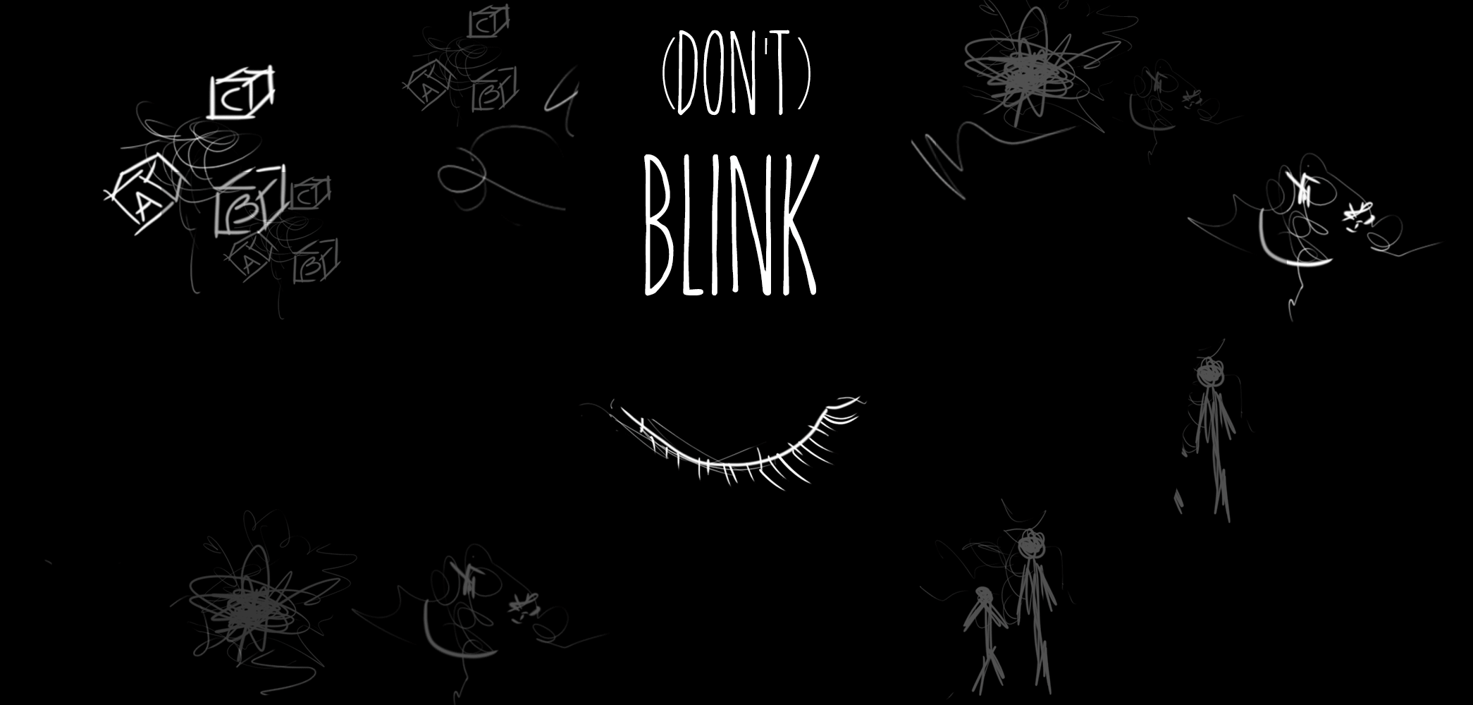
- The closed/open eye and the shape of eyelids closing tells the player they are closing their eyes
The choice of limiting some information, and making others completely unknown, such as the time constraints, were design choices I took to create a learning curve and to force the player to develop a sense of time and a winning strategy.
As people pointed out during the Research Question feedback session, these choices did not work out, as the game is too short to make space for learning.
The losing conditions, which are monster getting you with open eyes or fear bar filling up completely, are totally oblivious to the player, as the UI does not convey any information about it. The former is, although, pretty intuitive, because innate awareness or previous knowledge will bring the player to consider the monster the enemy.
The winning condition, as I mentioned, is also unknown, but if the losing condition of being caught by the monster is intuitive, the winning condition of avoiding the monster, thus surviving, can be intuitive too. If humans have the innate awareness that monster = enemy, then avoiding monster = surviving is also innate.
They are, although, lacking information about time. This is also a design choice I made consciously because I thought that uncertainty would work well with this game.
My plan for the next assignment, the actual re-design, is to find a design that conveys as much information as possible while leaning more on diegesis and less on meta representation.
Meta vs diegetic
In the version of the game I delivered for Game-A-Week, the UI is a meta representation: it exists in the game world (open or closed eye, growing fear), but it is shown in a non-diegetic way, as it is not represented inside the game world’s reality.
As the eye and the eyelids animation give real-time feedback about the state of the player’s eyes, the eye sprite is non-diegetic. The eyelid animation, on the other hand, is diegetic, as the game is in first person.
A possible way is to limit the information of space bar = close eyes to the how to play dimension.
The fear bar, on the other hand, is a little trickier. It gives the player a fixed standard about when keeping the eyes closed reaches the losing condition.
My solution will most likely be using the design I actually intended for the game before I got aware of the time constraints: create a meta visual feedback, using camera effects to represent urgency and tension, such as camera shake becoming stronger or edges of the screen changing color, or even, the music becoming louder.
Conveying information
Talking about the need of making the player aware of the winning condition, which is time-based, I would like to test the presence of a clock in the scene. For instance, the how to play dimension could let the player know that they must ‘survive’ until the morning, and the in-game clock would use a non-realistic time system (for example, 1 hour every 10 seconds (60 seconds: 6 in-game hours/from midnight until 6).
Contextualizing the monster behavior
Here comes the tricky part: designing a way to convey the monster's behavior. Is it necessary? According to the thesis for which there’s no need for a learning curve, yes.
On Update, the game checks for the presence of a monster in each frame. If found, after 1 second it checks if the eyes are closed. If so, it disappears after 1 second. If not, it starts moving. When colliding with the player’s trigger, it checks again for closed eyes. If yes, the player survives. If not, the player dies.
This internal system is, as far as I’m concerned, very difficult to convey.
I could use a non-diegetic color-based recognition, dividing the monster behavior in two: appearing and attacking. One more problem arises here: if I got rid of the eye sprite, in order to make the UI more diegetic, what element can teach the player this color-based teaching system? And also, since the goal of my redesign is diegesis, this solution is pointless.
Another way could be through monster animation. They could have different animations or poses for each ‘state’. Although, this also requires some learning, from the player's side, as there’s no way they can be completely aware of this system.
To conclude, as I don’t have a solution for this problem yet, I will reflect, research, and try out different solutions when it will actually come to redesign the UI.
Coming next: version 2.0 with reworked UI.
Files
Get (Don't) Blink
(Don't) Blink
A 'one-button' creepy game.
| Status | Prototype |
| Author | Lumine Noctis |
| Genre | Survival |
| Tags | 3D, Atmospheric, Creepy, Halloween, Horror, Monsters, one-button, Short, Spooky, Unity |
| Accessibility | One button |
More posts
- The Redesign of the User InterfaceJun 21, 2021

Leave a comment
Log in with itch.io to leave a comment.